
A month after revealing its new branding strategy and logo during MWC 2023, Nokia has finally proceeded in giving users and fans a look at what it plans for the future, specifically when it comes to the company’s digital products. More specifically, the Finnish tech giant showcased its new “Nokia Pure” design system, a software interface with a special focus on minimalism and fluidity.
Nokia says that this interface is intended for use in its upcoming digital products, software and apps, and is designed to be adaptable with different platforms while still maintaining a consistent look all throughout. Nokia made it a point to stick to guidelines which are centered around incorporating visual elements in line with this new approach. Shades of Nokia Pure can be found within the company’s new logo, which itself is a drastic redesign compared to the logo used for its mobile enterprise under HMD Global. As per Nokia’s words:
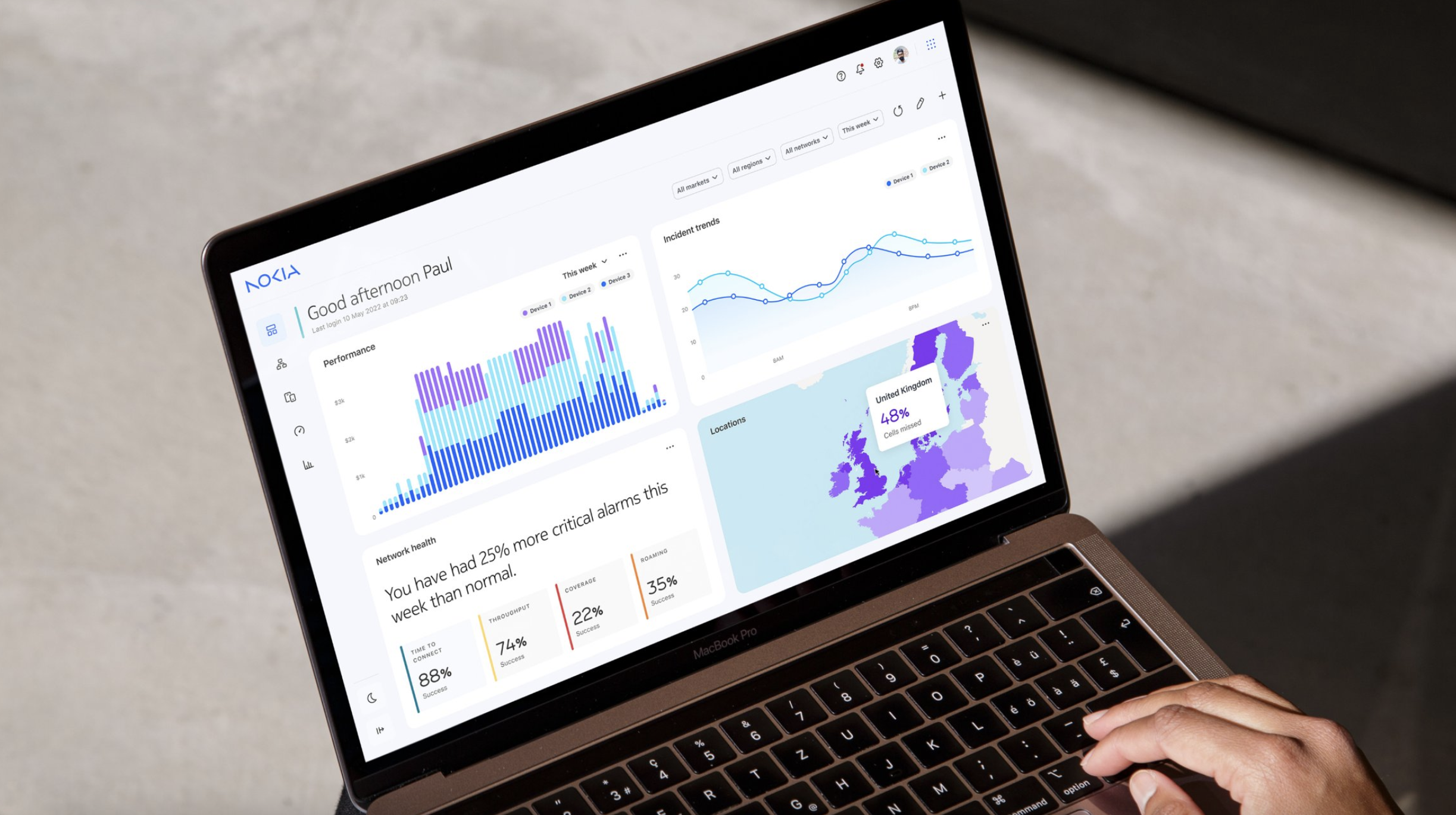
“Nokia Pure is the latest design system update that has been evolved to produce consistent, flexible and future-proof digital products. The system is made up of foundational elements, components, templates and guidelines, all of which facilitate in producing a fresh, clean and minimal new brand expression for Nokia B2B and Enterprise digital products in line with the new brand expression.”
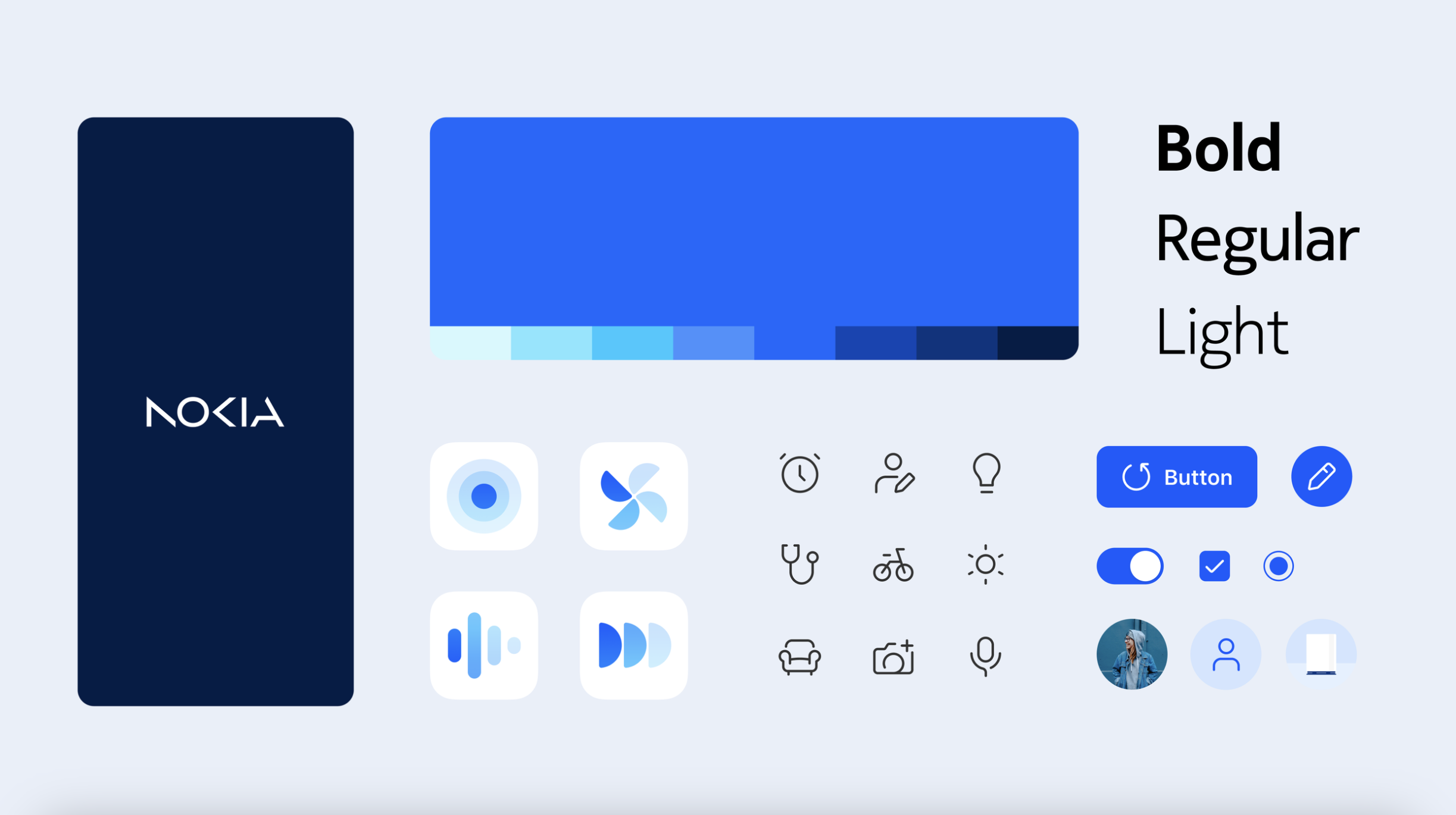
For example, the software icons which will be used in Nokia Pure will integrate designs based on a rather “linear” look of sorts, and even come with some minor visual cues from stock Android. With that said however, the Pure UI at the moment is targeted strictly for digital products, and there’s no mention if it will eventually make its way to Nokia smartphones in the future.
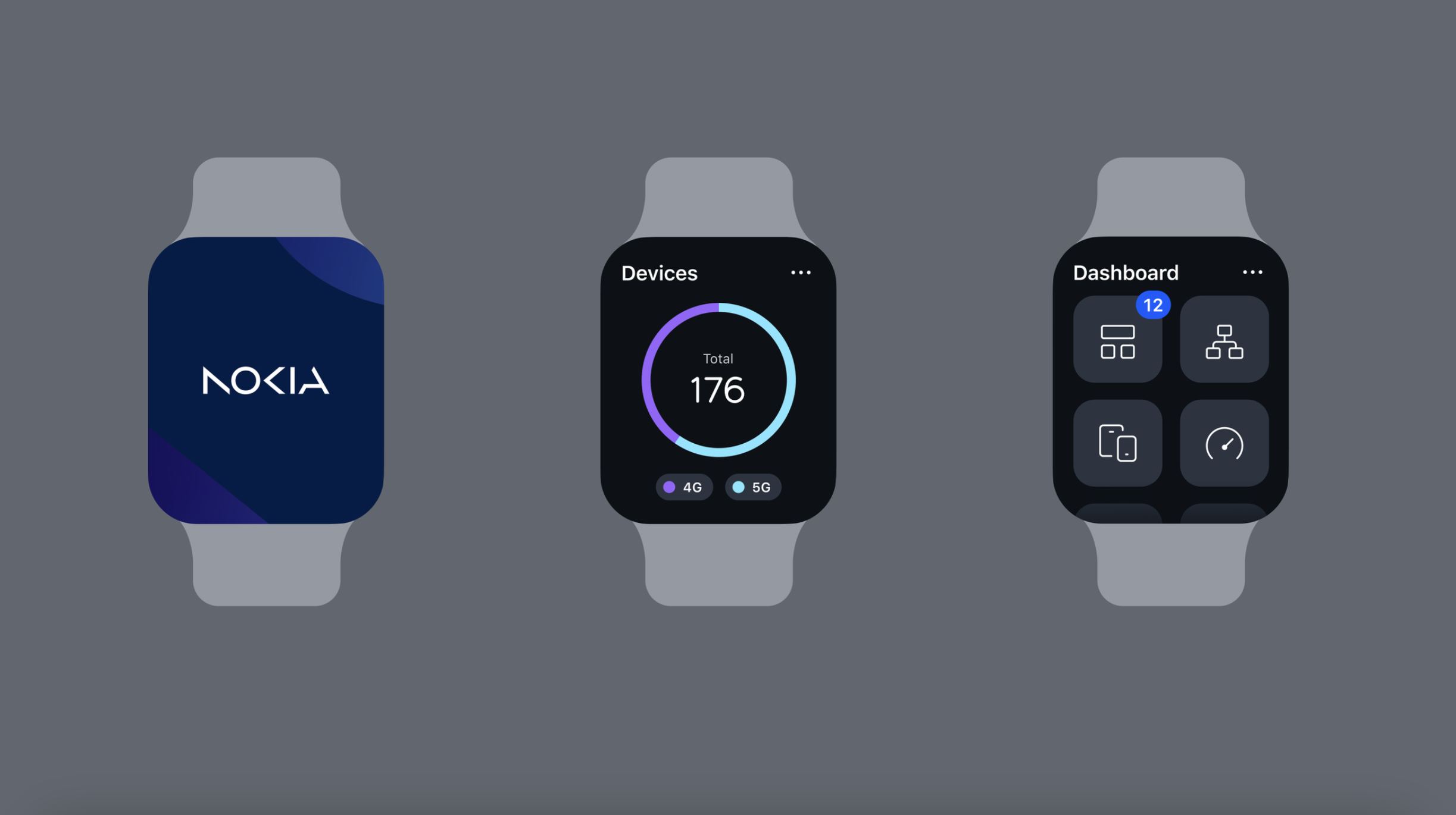
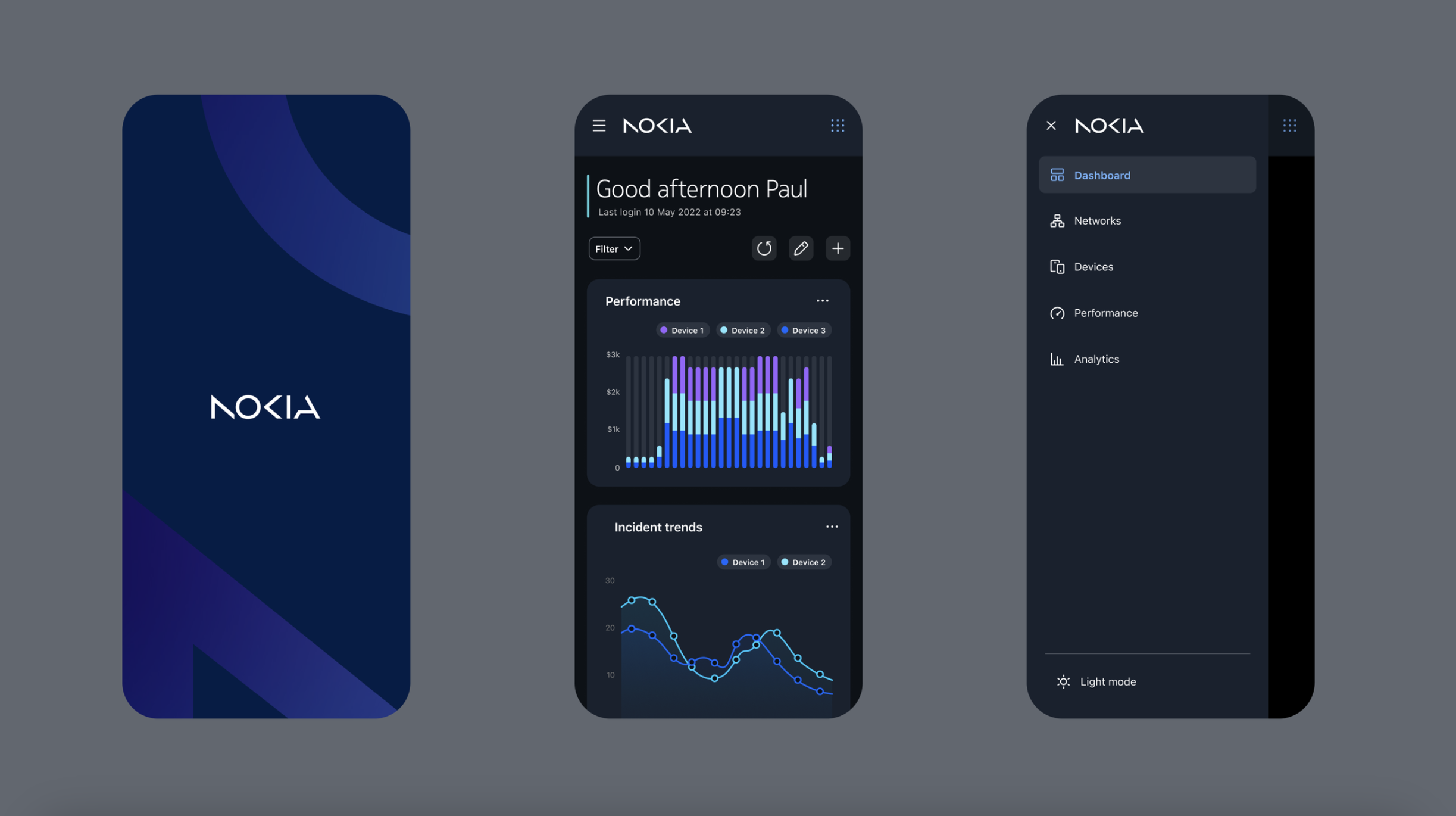
The icons, and even typefaces within the UI take on a distinct appearance of their own, much different from what we’ve seen from Nokia in the past. The company notes that the interface will be easily adaptable with different hardware platforms.
The same mentality towards design can be said for the Illustrations, that Nokia says have been crafted for simplicity and flexibility. It’s rather clear that a lot of thought has been placed into unifying this aesthetic all across the entirety of the interface, with Nokia going so far as to give the same overhaul to data feeds and infographics. Of course, all of this also translates to dark mode, which thankfully is an industry standard nowadays.
At the moment, it looks like Nokia has rolled back on its announcement, as its webpage displays a “coming soon” teaser. There was also a bit of confusion with regards to Pure UI, with some mistaking it for a new smartphone interface.
With all this being said, it should be intriguing to see how Nokia puts this new design language into action, and whether or not the company keeps it restricted to software-level availability. Long gone are the days were Nokia really carved out its own identity with regards to visual software design, but so far things are looking good for Pure UI.


